nav bar

about metutorialsmy housecontact me
Showing posts with label House. Show all posts

Friday, May 1, 2015

Home Tour {kitchen progress}

I'm going to share changes we have made in the kitchen, mostly with the magic of paint.... a lot of paint.  We actually completed what we have done several months ago when I was still pregnant, but with third trimester and new baby, little gets done {including blog posts}.  Better late than never though...

You can see a lot of "before" house pictures here to see what the entire house looked like before we did anything to it.  I'll re-post some "before" kitchen photos though to show you where all the paint had to come in...


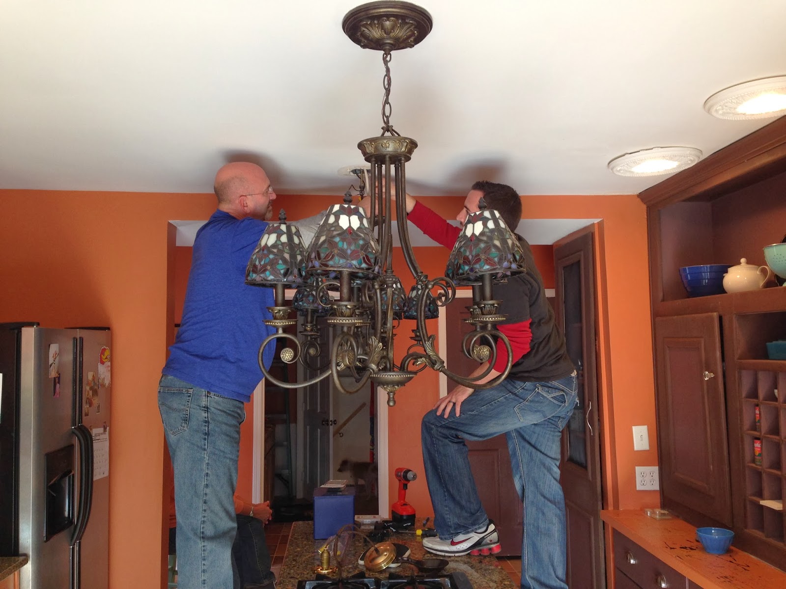
The two pictures above are even after we switched out the light fixtures over the island... I didn't get a great picture of the two HUGE chandeliers that used to be there except for this pic I snapped with my phone as Caleb and his dad were taking them down...
They hung right in your sight line when you were looking at someone on the other side of the island, plus they are just really not my style.

And the small eat-in area...

Soooo pumpkin orange and brownish/purple really weren't doing it for me... here's the now...


I choose black for the cabinets because I wasn't about to do four coats of white to try and cover the previous colors.  Two coats of black did the trick! I also choose a flat black paint to get a matte look... maybe that wasn't very smart of me since semi gloss is traditionally used for cabinets.  Only time will tell... right now my Norwex cloth wipes little marks off just fine.


I'm still a little unsure about the floors, I really don't like the color.  Too reminiscent of the previous colors I guess.  It's not in the budget to replace them, but maybe a heavy duty deck/porch paint? Some people think I'm crazy when I throw out that idea... again, time will tell.

I've constantly been on the hunt for a small antique table to put in this corner with two or three chairs. Hoping to hit that jackpot soon.

We had to do some cabinetry changes to get started... the previous owner had the dishwasher raised up so that you didn't have to bend over as far when loading and unloading.  I wasn't a fan because it took away from useable counter space that I already don't have a ton of.  So we lowered it down to normal height, which meant we needed to get a new counter top because the granite stopped and there was just a stainless steel counter over the dishwasher.  Fine with me... I didn't really like the granite anyway.  A local company made us a new cabinet for the opposite side of the dishwasher that matched the cabinets for about $150.

The new counters are birch butcher block from Ikea.  I finished them with a coating called Waterlox that lots of other bloggers with Ikea counter's had used.  I'm not sure I'd use it again... I would be interested to see what someone who just used the tung oil that Ikea sells thought about their finish and durability.  The Waterlox is just a lot of work to apply and it does bring out a very warm tone in the wood {which I don't necessarily dislike}.  But maybe since I have butcher block next to my sink it's necessary to use a Waterlox-like product, I don't know.  It does cause liquid to "bead up" when it gets on the counter, which is good.


This picture really shows some of quirks of the cabinets, they definitely aren't perfect.  There are also two styles of cabinetry in the kitchen.  It has a very cottage-like, mismatch quality to it. This "reno" is all about embracing that and making it look as good as possible without replacing much. :)  The drawer pulls and knobs are brass... duh. Who doesn't love brass right now?!

The pendants, also brassy, I bought long ago when we first moved in.  Love them.

The sink is new, and no it's not under mount... obvi.  An under mount sink would have meant really perfect cuts made in the butcher block {by us, we installed it ourselves, with help}, plus sanding the cut edges with a tool we don't have, and extra treatment of the Waterlox stuff... like 6 layers of it... so I read.  No thanks, I think the over mount looks fine and putting it in with the counters was much easier!

The wall behind the sink desperately needs tile and open shelving... that's on the to-do list, maybe this summer!  Once I have open shelving I can clear my counters off! Plus my everyday dishes are plain white, so they can go up there too!
the writing on my glass containers is a product of a long nap by Reid and a new chalk marker for myself :)

I do love how some of my dishes stand out against the black...


One thing I desperately need to do is put fabric or something under the screen that is the top half of our pantry door.  I mean...why? Why would a person make their pantry door see through...? Also, too bad I didn't organize my pantry before I took this picture.  Real life people.

Well that's the progress folks...


Sources:
Wall paint color: BM Classic Gray {mixed in SW paint}
Trim paint color: SW Simply White
Cabinet pain color: BM Black Panther {mixed in SW paint}
Counters: Ikea birch butcher block
Brass hardware: Martha Stewart line at Home Depot {online}
Recipe box: Rifle Paper Co.
Brass Pineapple: antique
Stools in kitchen: antiques
White cast iron sink: Home Depot
Glass containers: Target & Hobby Lobby
Colored bowls: Anthropologie
Island pendants: Etsy

Tuesday, March 3, 2015

Home Tour {Reid's nursery}

My baby is two months old! What an exhausting, amazing, crazy, wonderful two months its been! Needless to say I've been busy.  It's been hard to adjust being busy with things that don't involve crossing things off of a to-do list.  On my to-do list for a while now has been sharing Reid's nursery... so I'm finally getting to that!
I shared my ideas for a nursery here {before we knew the gender} and here {after we knew the gender}.  I stuck with most of the ideas from the second mood board.  The vintage paint by number picture seen in that post inspired the colors for the nursery.  First we should see the hideous before picture of this room...


After we scraped some terrible wall decals off the of walls we started adding wainscoting.  I wanted horizontal wood paneling, so we used pine tongue and grove paneling.  We topped the paneling with a 1x4 pine board to trim it out.  The only difficult part of this was in a 100 year old house, nothing is level.  Leveling the bottom board is necessary to not make the rest of the paneling look wonky, so if you look closely there is a range of gaps between the floor trim and the first panel on top of it. After that we gave everything a nice thick coat of primer! 

The wall color for the room is Benjamin Moore Harbor Gray and the trim color is Sherwin Williams Simply White {as is in the rest of the house}.  Here are the after photos...


The paint by number ship print that started it all is the center of the gallery wall...


We added a wardrobe to the room because this room didn't have a closet.


Antique store finds sit upon the shelf...

Originally I had wanted this crib in a gray color, but after many attempts to order it, it was unavailable everywhere.  I'm actually glad because I ended up really loving the black!

The anchor print crib sheet is one of my absolute favorite things in the entire nursery! It adds to the nautical theme without being overwhelming.

Over the crib, I went with a garland rather than a mobile, which I was able to make myself with yarn I already had.


I used the lined basket as a hamper, while the other baskets in the room hold toys, stuffed animals, and extra blankets.

Source list:
Crib - DaVinci Jenny Lind crib in black via overstock.com
Rug - Jute Chenille Herringbone rug in Ivory {8x10} via West Elm {got on sale and saved shipping costs by ordering it and picking it up from the store}
Sheepskin rug - Ikea
Crib sheet - Anchor Print crib sheet via RH Baby & Child {gifted}
Dresser - antique store {gifted}
Rocker - already owned, it was Caleb's grandmothers! Bought my own fabric and had it reupholstered
Pouf ottoman - clearance from Target
Baskets - all three found at Tuesday Morning
Mirror - Tuesday Morning
Tongue and grove paneling - Lowe's
Black and gold accent table - Target
Striped Throw - Ikea
Blue Turkish Cotton Throw - clearance from Anthropolgie
Black & White pillow - Ikea {already owned}
Pom-pom garland - DIY
Picture Ledges {holding books} - Ikea {already owned}
Large shelf and brackets - Ikea
Picture frames - Target, Ikea, and vintage finds
Vintage paint by number - Etsy
Hand drawn Bible Verse - DIY
"The World is Your Oyster print" - via Rifle Paper Co.
"Rise and Shine" print - via Minted
Diaper pad changing cover - Etsy {gifted}
Lamp - Ikea {then spray painted gold}
Wardrobe - Ikea {handles were spray painted gold}
Curtains - Fresh Linen Curtain Panels in blue via Land of Nod
"R" initial - Zinc Letters via Anthropologie {got on sale!}
Mini pendant - Retro KU pendant via Rally House

Paint colors - walls are BM Harbor Gray, trim is SW Simply White


Friday, February 14, 2014

home updates {paint & fireplace facelift}

We have been in our house for about 3 1/2 months now and I really thought I'd be better at updating the blog with improvements we have made... but that hasn't been the case!  For whatever reason I have not been motivated about updating the blog at all, but now I'm ready! :)

The bulk of what we have changed is wall color.  So far we have painted the dining room, living room, entry way, & stairway (which includes the upstairs hallway).  It has dramatically changed the look of the house, considering all the rainbow colors that filled those rooms before.

The living room/entry way/stairway/upstairs hallway is all the same color.  It's a shade of white with a hint of gray/beige {greige, if you will}. Here is a quick look into the entry way before & after with an Istagram pic I posted...

The color is Sherwin Williams Oyster White.  Its a very nice light neutral that isn't too warm or too cool in my opinion.


Here is a quick glance at the new dining room color... first the horrible candy apple green before pic


And now....
 This color is from one of my favorite home decor stores, Nell Hills.  The owner of that store has her own line of paint and each room of her amazing store is painted of her colors.  I loved getting to see the wall color up in a nice bright room... it kept me from feeling like I needed to paint a million samples on my own wall.  The color is called Abby Steps; it's a dark gray/blueish color.  This picture was taken in bright daylight so this is the lightest it ever looks.  It's darker at night, almost like a charcoal color. I went ahead bought the paint right from Nell Hills because the price of the gallon there was no different than from anywhere else.  Plus, I didn't want to have to go through color matching and whatnot. 

I also decided I didn't like the surround tile on the living room fireplace - it was brown up next to dark stained wood of the mantle.  I really wanted to lighten it up and keep it a very simple and classic color scheme.  The original tile layout had a darker brown tile border on the tiles flush with the floor, I decided to keep that detail by using two colors.


Since this was very old tile, there were definitely some flaws in the tile - which I knew would probably stand out more when I painted.  But with a hundred year old house, that's just what ya get.


And now...

I had to prime the tile first with a primer that a guy at SW recommended.  The white color is a mix {yes, because I'm complicated} of SW Oyster White {the wall color} and SW Roman Column.  I started my first coat with just the Roman Column color, but it was a little too white-white for me.  So I mixed in a little of the Oyster White wall color to make it a bit creamier.

The blackish stripe at the bottom is SW Sealskin.

Here the very beginning pic to now...

That's it for now! More to come... hopefully sooner rather than later!
Happy Valentine's Day!

Saturday, November 23, 2013

the new {old} house before pictures

Well after being in the house for about 3 weeks, I'm finally getting around to gathering all my "before" pictures to show.  Most of these pictures I took at our inspection of this house... which was back in July or August {before the first sell of the Hickory House fell through - read about that here}. So if you pay close attention to the outside pictures you'll notice the seasons aren't the same.  I did forget to take pictures of certain rooms during the inspection {like the front of the house and the kitchen... my mind was absent that day...}, so a few pictures I recently took.

A couple of facts about the house...
  • it's 100+ years old
  • we nicknamed it the "rainbow house" when we first looked at... you'll soon see why.
  • the style of the house is folk victorian, not to be confused with a traditional victorian with lots of bay windows and gingerbread trim... folk victorian is more simple and usually the house is a square or "L" shape.... ours is pretty much a square.
  • 3 bedroom, 2.5 half {3 bedroom is a step down from our house we just moved out of which was 4 bedroom... but we were fine with that}
  • 2 story {all the bedrooms are on the 2nd floor}, and it does have a basement, but not one we could ever "finish"
  • this house is part of Caleb & I's attempt to live more simply that what we did before {smaller house, lower mortgage payment}
Let the tour begin....
Front - I don't love the colors... but I don't hate them. For now they will stay as is.    Can you spot Lola??

And lets transition back to the summer season... :)
Anyone else need deck stairs that 20 people could stand on at a time?

I love the old details like this door handle and the trim - this is the original front door of the house.

Foyer/Entry
Did you know red is one of my least favorite colors on walls??? Lucky me! Don't worry... these are short-lived.


Standing on the landing of the stairs, you can either go up or take a back hallway to the kitchen

Living Room
Dark purple? Also not a fan...


The first of two fireplaces

Standing in the dining room looking into the living room

Dining Room
Ugly green? Yes!
Fireplace #2... that's the previous owner's wood, not mine.  I inquired about buying it... she wanted $200... ummm no.

Kitchen
 Pumpkin orange, anyone?

I already changed the lights over the kitchen island... they were too big and horrible looking! I forgot to take real pictures before they came down, so here are phone pics of Caleb and his dad taking them down...
They were as wide as the island itself!

And two of them! I couldn't wait to get rid of them so I could stop ducking my head while cooking!

And here you can see what I replaced them with... simple globe lights! One still without a bulb. :)


Laundry
Washer/Dryer coming soon! They will be stacked in that corner!

Bedrooms
This room also needs painting and that crap taken off the wall... are you seeing a pattern here?


This is a VERY old dress that was found within the walls of the house during renovations years ago... it stayed with the house as part of the history.

Hall bathroom
I love the classic black & white tiles in this bathroom


Master Bedroom


Master bath


Walk-in shower tile floor... so glad her tile choices weren't anything like the wall color choices!

That's pretty much it! Lots of painting has already taken place so those pictures will come as I get more rooms in order!